Take an in-depth look at 1Home Graphs in video format:
With upcoming updates, we added a powerful new way to gain insight into your system: Graphs.
They make it possible to see the state of your home at a glance, not just in the moment but over time.
Instead of relying only on live values, you can now look back and spot patterns, trends, or anomalies that tell a bigger story about how your smart home projects behave.
Device History at a Glance
Every device in your dashboard now comes with a History tab. You can access it from the Devices view in 1Home Dashboard and clicking Configure on a specific device.

From there you can access the history tab.

Selecting it reveals a timeline of recent values, such as the last 24 hours of activity from a humidity sensor. You can adjust the time range to see shorter or longer windows, making it easier to diagnose issues.

If humidity levels are consistently high, for example, you might notice it’s time to fine-tune your ventilation automation. Device history provides the first layer of visibility—clear and specific to each device.
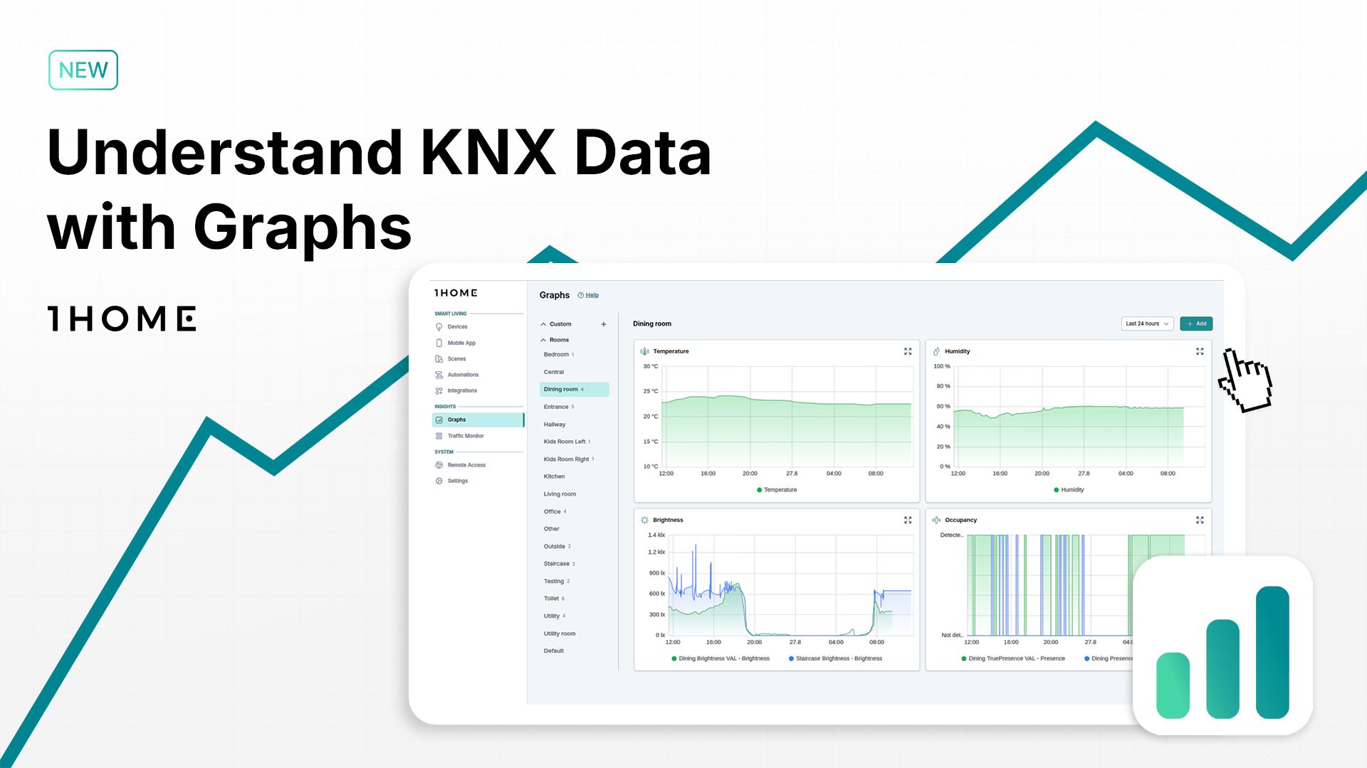
A Dedicated Graphs Section
Beyond individual devices, you can now explore a full Graphs section on the left side of the dashboard under “Insights”. Here you’ll find an overview of every room in your project, with automatically generated graphs for temperature, humidity, brightness, occupancy, and more.

Multiple sensors of the same type in one room are combined on a single graph, giving you a complete picture of what’s happening in that space. This turns raw values into a story of how each room evolves throughout the day.
Building Custom Graphs
Automatic graphs are just the start. With custom graphs, you can track exactly the metrics that matter most for your projects.
You can create your own custom graphs by clicking + Add in the top right corner of the Graphs section, giving it a name and adding the correct metrics.

In the dining room, for example, you might want to visualize CO₂ levels. By selecting the group address directly, the graph is created instantly. From here, you can layer multiple attributes, like temperature, set points, or operating modes, to build more comprehensive views.
Creating Custom Views
Sometimes a single graph is not enough. That’s why we also added the ability to build custom views dedicated to a theme - like energy.
On the left side of the Graps section, there’s a list of all the different rooms. At the very top of that list you’ll see a “Custom” section and next to it a + sign. By clicking on it you can create your own custom view.

Within the custom energy view, you can create graphs for car charging, combining both current power draw and total energy consumed, resulting in overlapping graphs, which allows for an easy comparison of Related Metrics.

Adjusting the time range lets you see patterns across minutes, days, or even weeks. Vacation periods or spikes in activity are revealed in seconds.

Why Graphs Matter
Graphs transform raw KNX and system data into clarity. They allow you to see not only what is happening, but also how it develops over time. Trends become visible. Anomalies stand out. And optimizations are easier to plan.
With this update, every integrator gains a powerful new tool for monitoring, troubleshooting, and fine-tuning projects.